Study Buddy
A responsive web app that connects students with their peers.
CareerFoundry Project
July - September 2022
A responsive web app that connects students with their peers.
CareerFoundry Project
July - September 2022
Overview
Project Overview
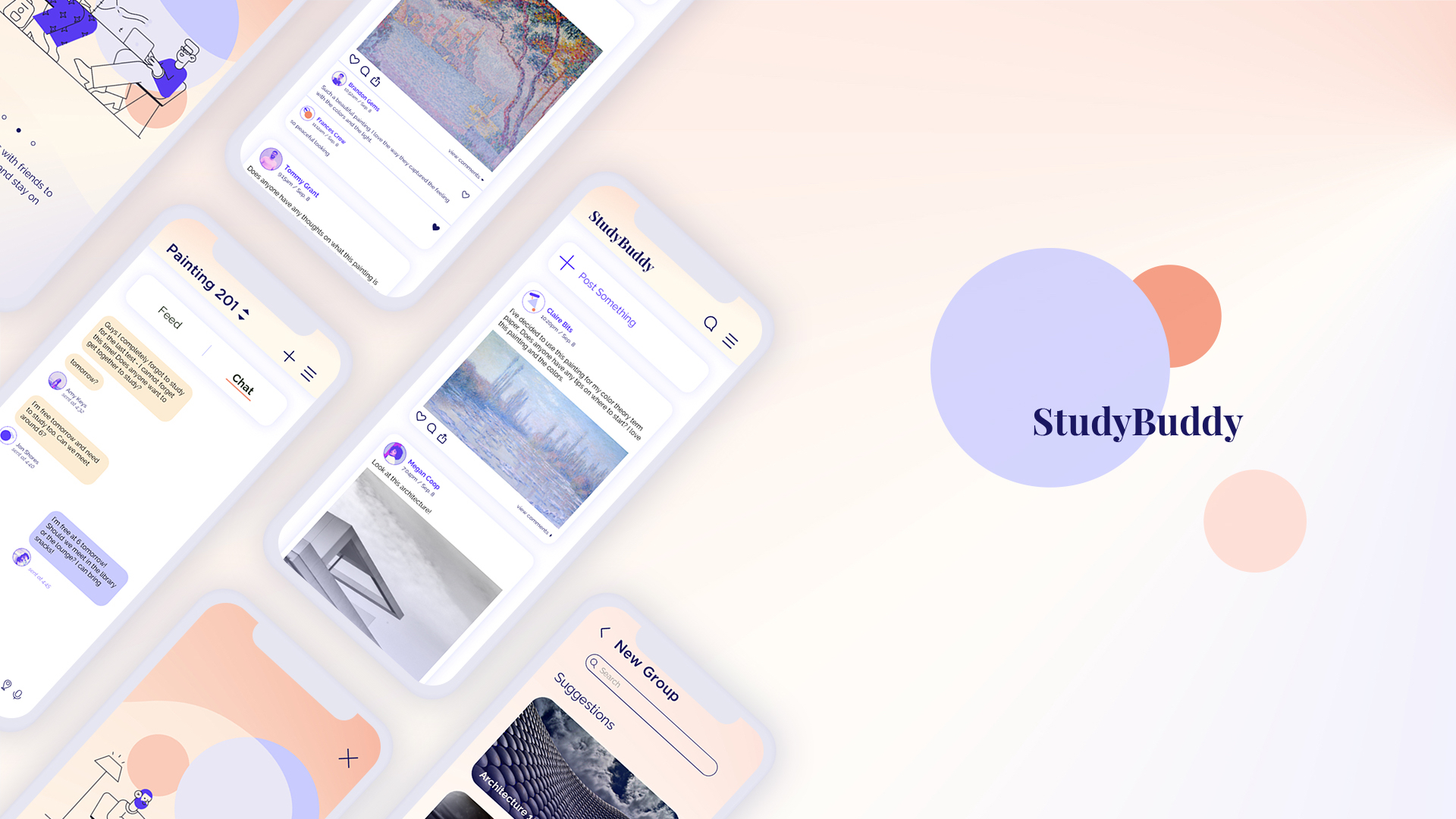
StuddyBuddy is a responsive web app that brings students together to help them feel connected and motivated to collaborate and study together. Staying on top of school work can be a daunting and overwhelming task, but having a platform that can be used to keep one connected with fellow students and friends can make it a little easier.
Problem
It can be hard for students to stay motivated when it comes to studying, especially if they are trying to do so on their own.
It can be hard for students to stay motivated when it comes to studying, especially if they are trying to do so on their own.
Solution
Students will feel more motivated to stay on top of their studies if they have a growing social network of fellow students and friends pursuing similar goals.
Students will feel more motivated to stay on top of their studies if they have a growing social network of fellow students and friends pursuing similar goals.
Insights
Proto-persona: Alex
I started this project with my proto-persona in mind. This helped me understand the type of user who might benefit from using my app.

Alex is a student enrolled in an online course who also works part time as a retail store manager. His goal is to complete his course as quickly as possible and gain marketable skills. He wants to connect to the other students in his class in hopes of studying together and networking for future opportunities.
User Flows
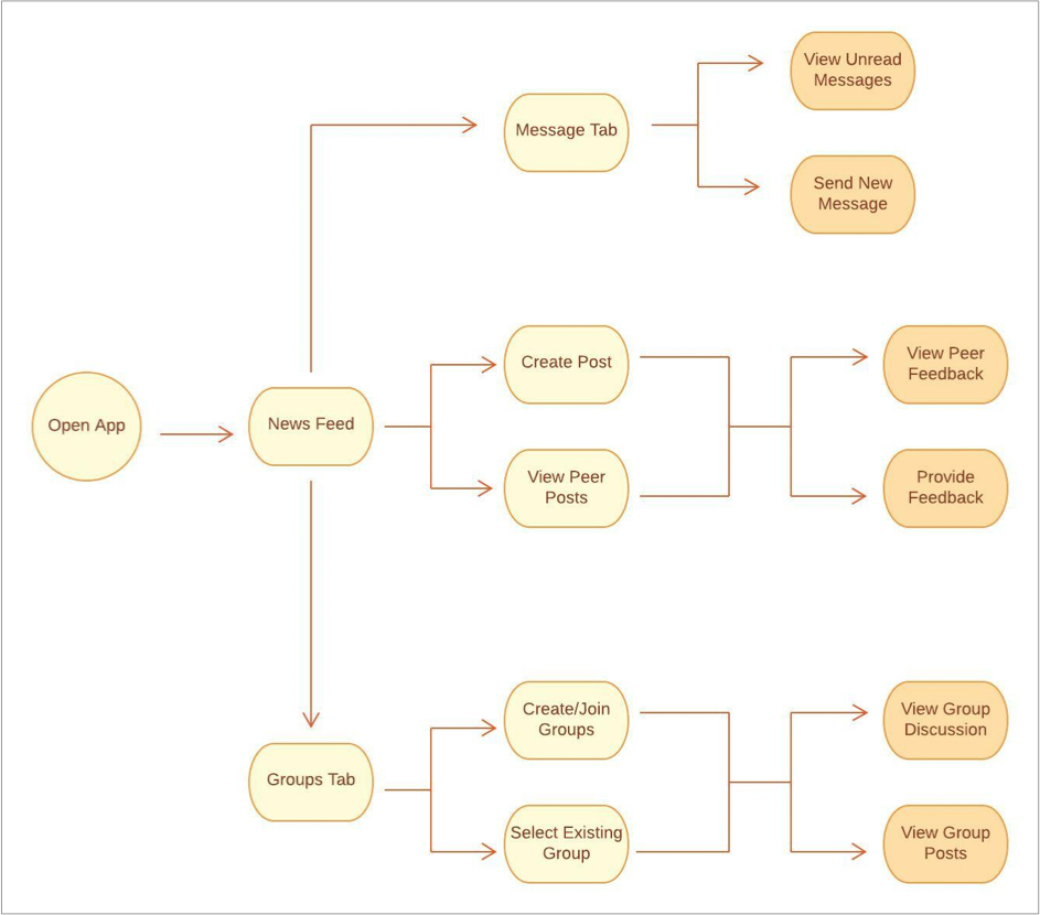
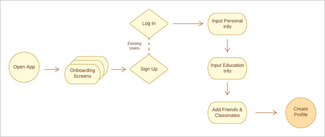
With my proto-persona in mind, I moved forward by creating user flows, mapping out important tasks that users would need to be able to complete. I wanted it to be easy for users to create a personal profile, add classmates/friends, chat with those friends, and create posts both public and within their groups.
Key Tasks
- Create personal profile
- Add classmates and friends
- Chat with peers
- Create public posts
- Create groups for specific classes
- Post and chat within groups
Design
Mid-Fidelity Wireframes
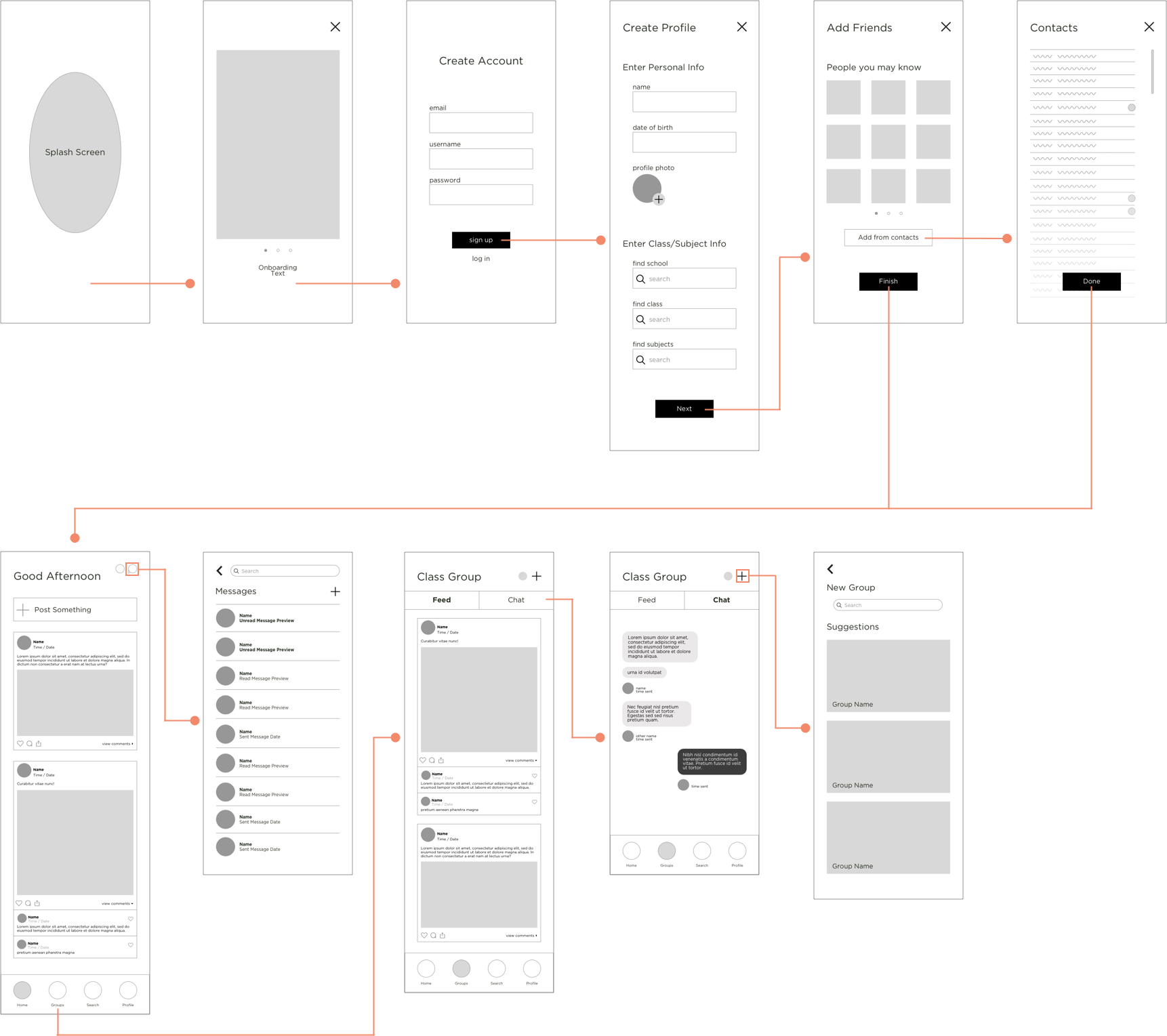
After my user flows were complete, I moved on to prototyping. Starting with lo-fidelity, I mapped out my screens, figuring out how the user could complete the key tasks in the most efficient way. Then I created mid-fidelity wireframes to start mapping out key elements more concretely.
Visual Elements
Once I was happy with my mid-fidelity wireframes, I created a color scheme and solidified other visual elements I wanted to include in my design. I created a style guide that would be implemented across all screens.
Color Scheme
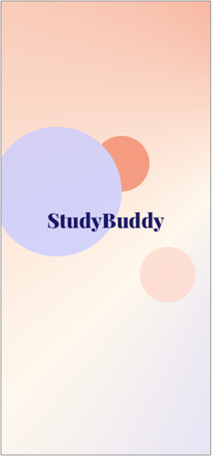
Our colors are meant to be fun and gender neutral. Midnight blue is used for all the text, while electric blue is the main accent color. Coral should be used for any CTA, with perriwinkle and warm ivory as supportive colors.


Typography
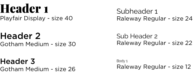
We utilize Playfair Display, Raleway, and Gotham for our fonts. Playfair is used for the wordmark, which is present on the home screen. Gotham is used for the main headers, and Raleway is used for the subheaders and all body text. For body text with paragraphs, Body 1 should be used with line spacing of 15px.
Iconography
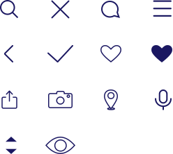
Our icons are simple line drawings whenever possible, with rounded ends on the lines. When they are meant for interaction, they should have a touch target of 48 x 48px.
Illustrations
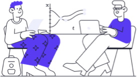
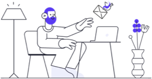
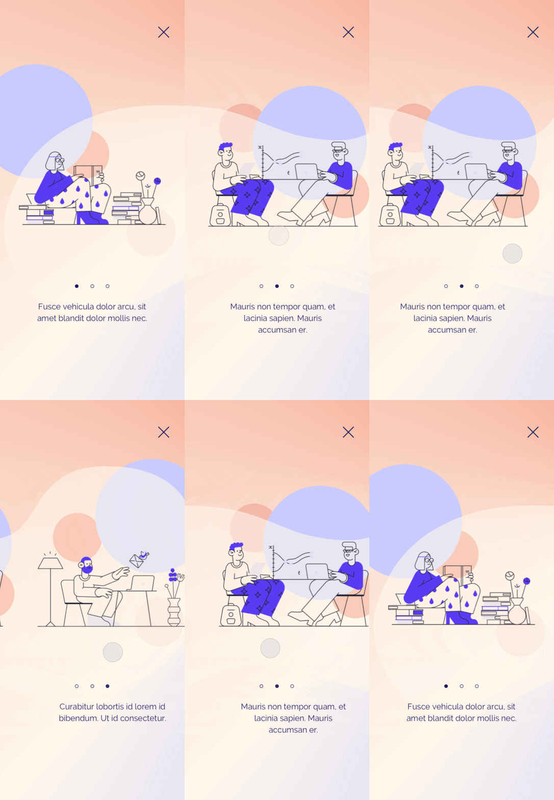
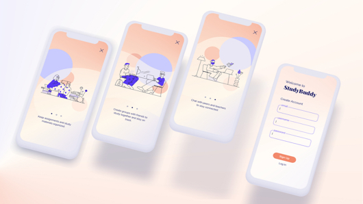
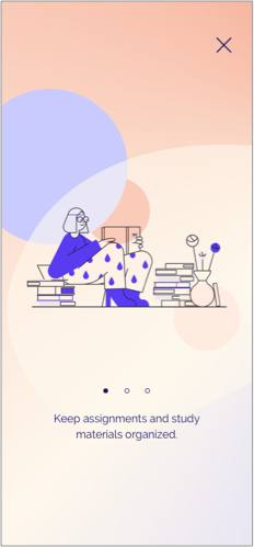
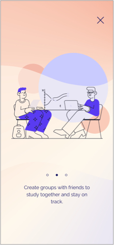
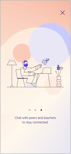
Our app will rely on illustrations for onboaring, as well as prepoulated profile images to be used as avatars until the user uploads their own image. They should be simple and fun and utilize the primary and secondary colors from our color scheme.


Onboarding Animation
Final Product
High Fidelity
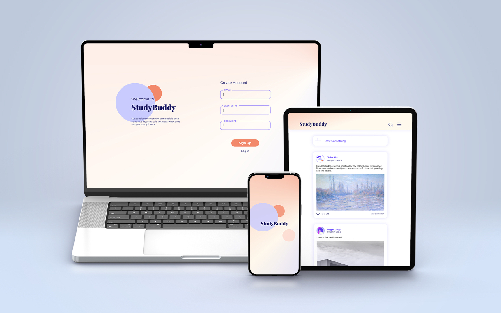
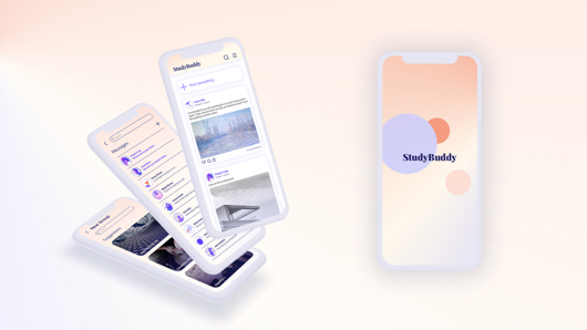
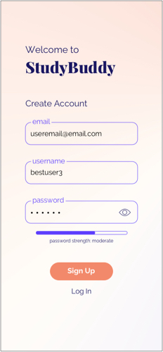
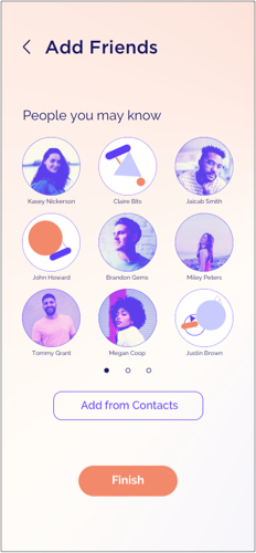
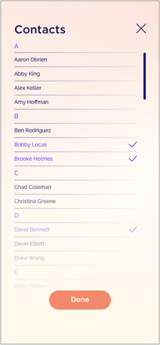
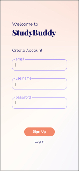
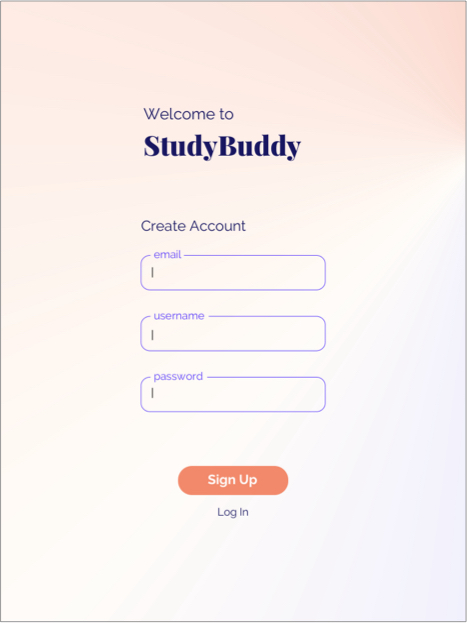
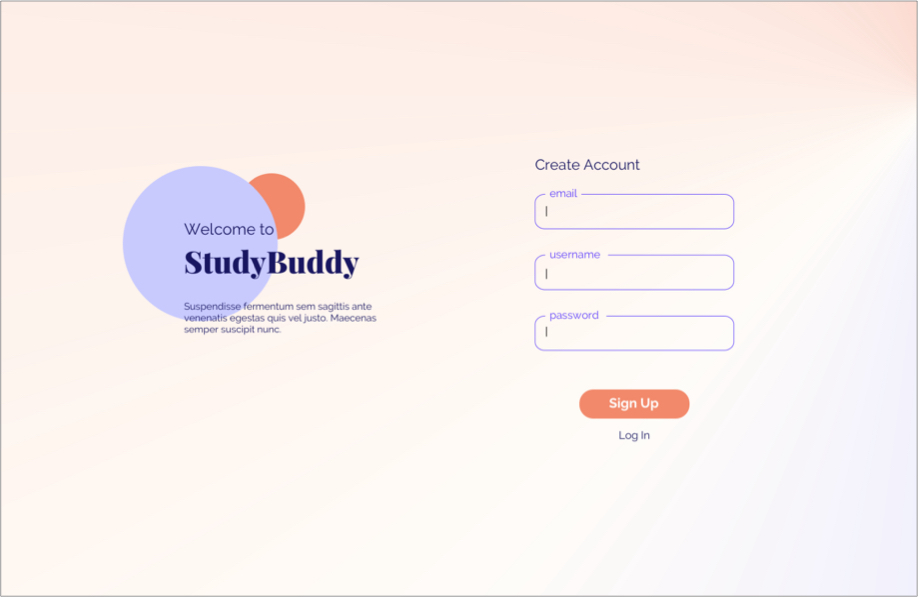
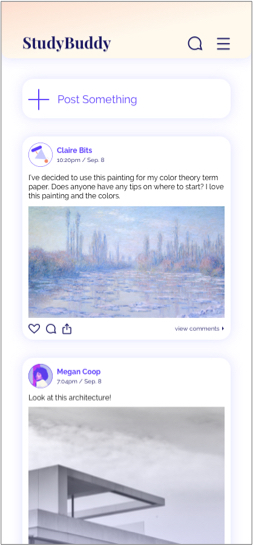
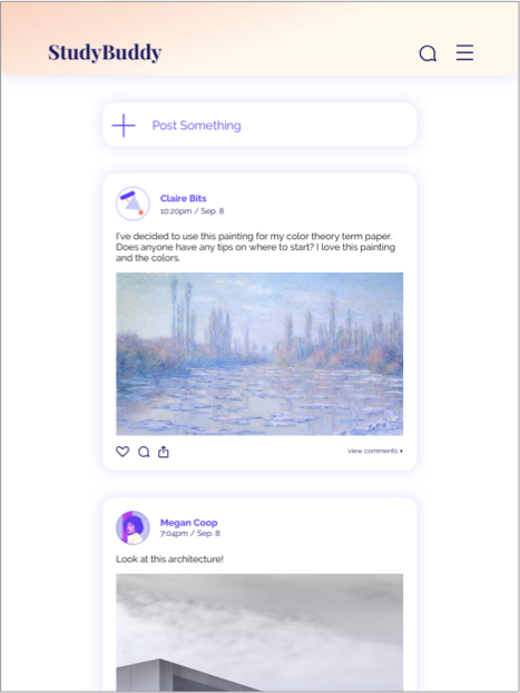
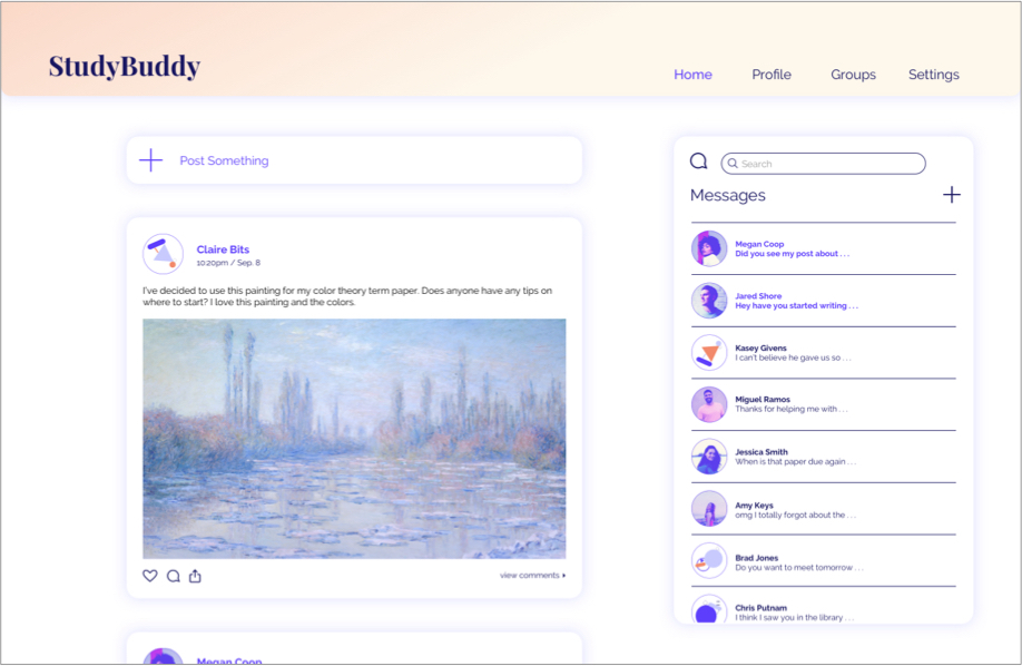
With all the important elements of my app figured out and the style guide solidified, I moved on to create high fidelity versions of my screens.
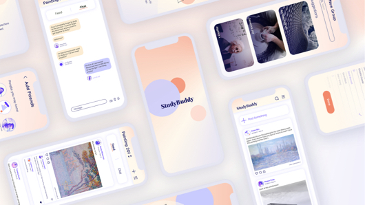
Final Screens

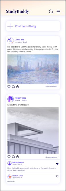
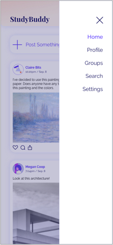


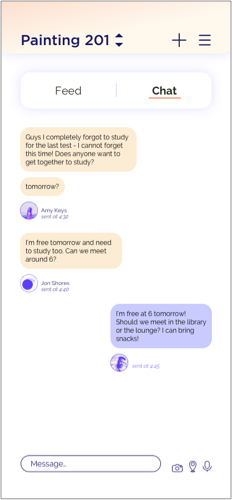
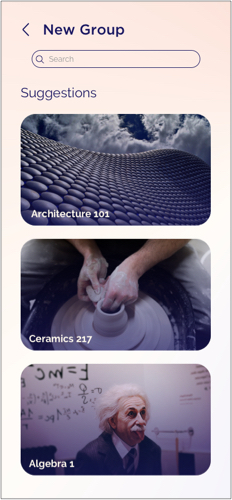
Responsive Designs
Breakpoints: 414 x 896px | 768 x 1024px | 1512 x 982px
Next Steps
Conducting usability tests would be the best next step for this project. Feedback from participants would be helpful in understanding the functionality and ease of navigating the app, as well as how users respond to the visual elements in place.
Expanding the usability and adding more screens to the desktop and tablet breakpoints would also be a valuable next step.