Superior Foundation Repair
A redesign project for an established foundation repair company in Austin, TX.
Freelance Project
March - April 2023
A redesign project for an established foundation repair company in Austin, TX.
Freelance Project
March - April 2023

Overview
Background
Superior Foundation Repair is an Austin-based company that specializes in leveling homes and permanently repairing their foundation issues using steel piers. Their website was created in 2017 and had not been updated since then. They have been very successful and have an established SEO strategy, but need their website to better represent who they are as a company and what they do.
The main purpose of Superior Foundation Repair’s website is to educate potential clients about the steel pier method, which sets them apart from other foundation repair companies, and to allow clients to get a free estimate and learn about financing options. They pride themselves on the quality of their work and highlight that working with them will provide a one-time solution to foundation problems, and promote their lifetime warranty.
Their current site is outdated and difficult to navigate. It has a confusing content organization, difficult navigation, poor visual hierarchy, and design elements that do not reflect their brand or the work that they do.
Project Overview
I sought to create a full, responsive redesign of the company website, both mobile and desktop. The primary goals were to reorganize the structure of the sight, simplify and restructure the information on each page, and revamp the aesthetics of the whole sight. I wanted to give the site a more updated, fresh and simplified look that would be representative of the company as a whole and helped improve the user’s experience.
I sought to create a full, responsive redesign of the company website, both mobile and desktop. The primary goals were to reorganize the structure of the sight, simplify and restructure the information on each page, and revamp the aesthetics of the whole sight. I wanted to give the site a more updated, fresh and simplified look that would be representative of the company as a whole and helped improve the user’s experience.
Organization
The menu of the current site is confusing and difficult to navigate. There is no obvious homepage, the names of each page are confusing, and the contact phone number listed opens a link to Skype when selected. There’s no active state indicator to let the user know which page they are on when the menu is selected.
I started this project by rethinking the structure of the site as a whole and creating a sitemap to better organize the important information needed. I renamed each page on the site, simplified the menu items, and restructured the organization of pertinent information to provide a less confusing and repetitive experience for the user.

Preliminary Wireframes
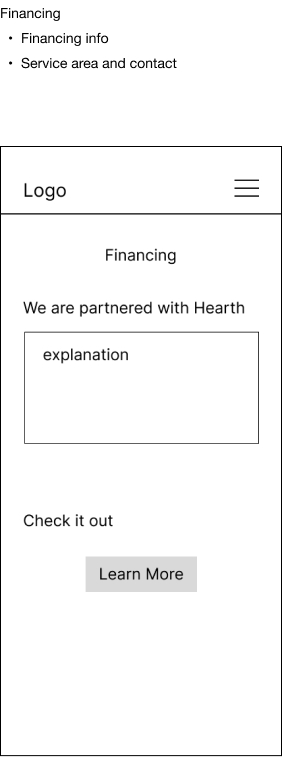
I then created low-fidelity wireframes based on the organization of the new sitemap utilizing a menu icon in the top right corner for navigation.


Visual Elements
Once the organization of the site was established, I started working on the design elements. I wanted the site to have a powerful, sleek feeling to reflect the work they do at Superior Foundation Repair. I also utilized the various design elements to establish a hierarchy and lead the user through each page with ease.
Color Scheme
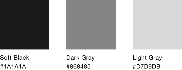
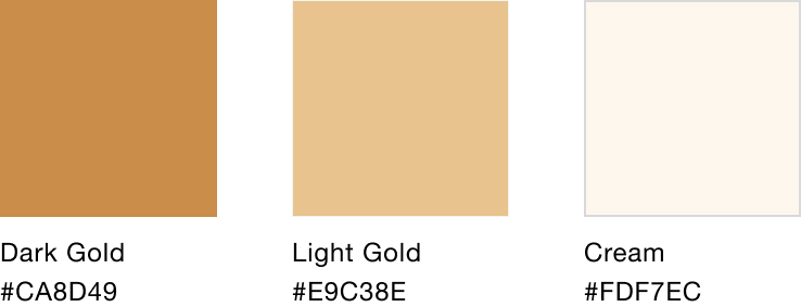
I chose a mostly black and grey color scheme with pops of gold to achieve the powerful, sleek look I was going for. Soft black is the primary background color, and the gold colors guide the users through important information and actions.
Typography
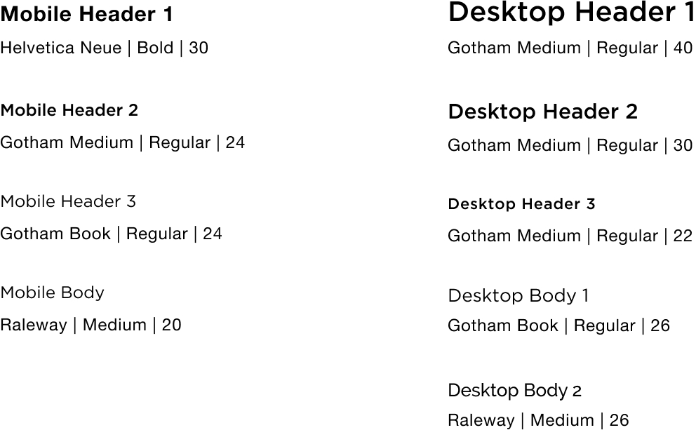
This site relies heavily on text to walk the user through the steps of the process of foundation repair and provide them with all the information they need to know. I used a combination of Helvetica, Gotham and Raleway throughout the site. As with the other visual elements, I wanted the text to appear powerful and sleek, but also convey a sense of decisiveness along with being clear and easy to read.
Logo Redesign
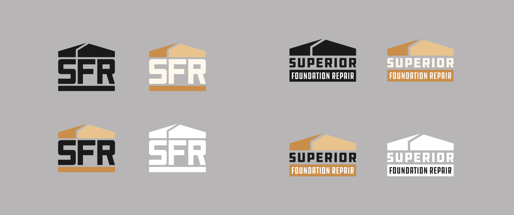
The current site utilizes an outdated logo that doesn’t quite fit with my redesign. I collaborated on the creation of a new logo to better reflect the new, updated feel of the site.
UI Elements
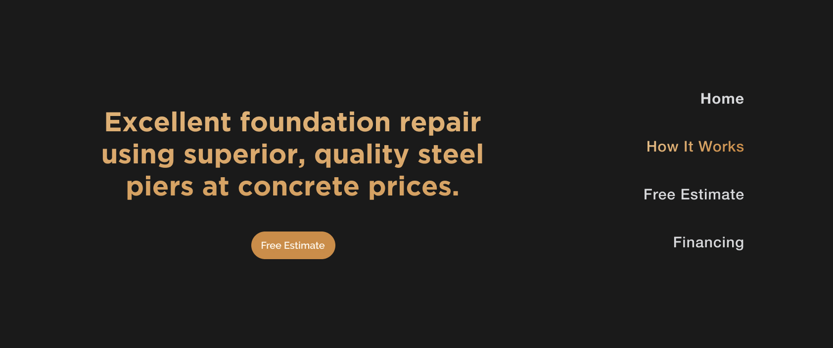
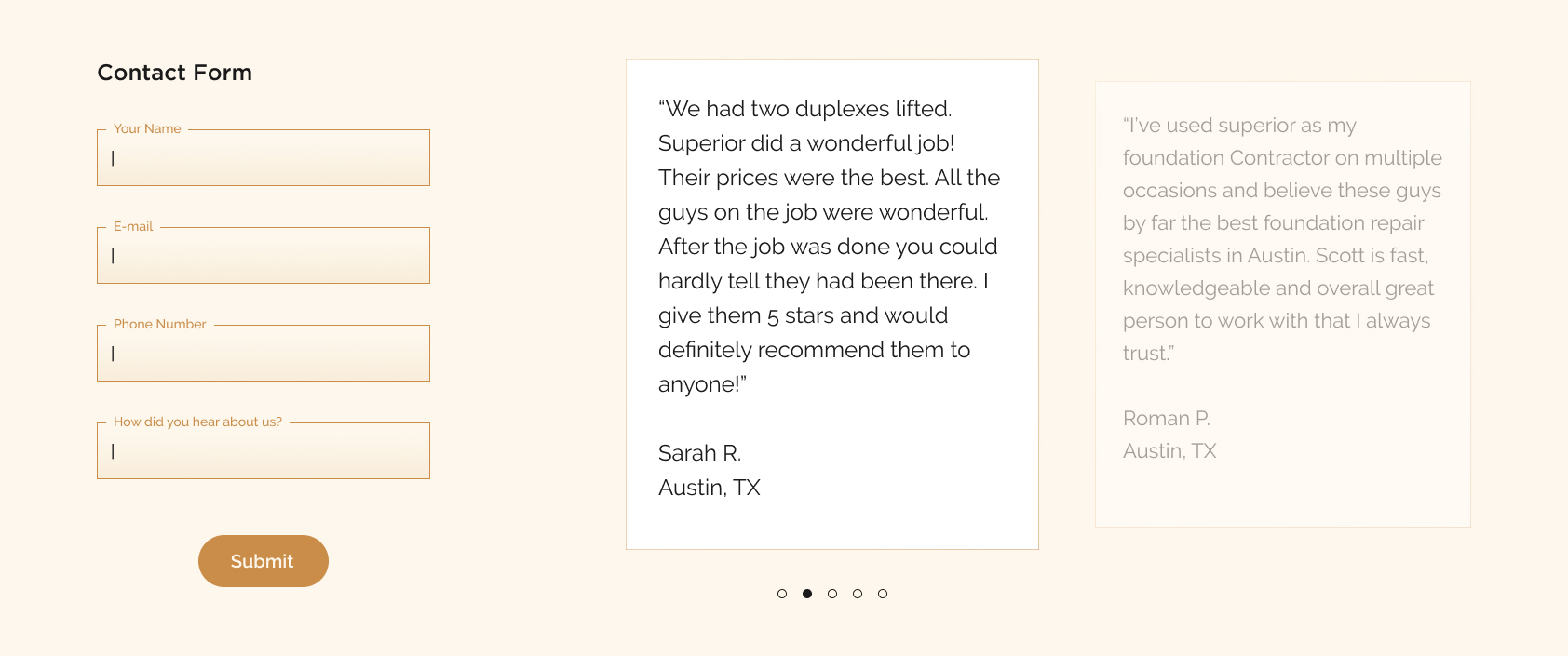
All UI elements are against either the soft black or cream background color and utilize gradients and color to highlight important elements and actions.
Imagery
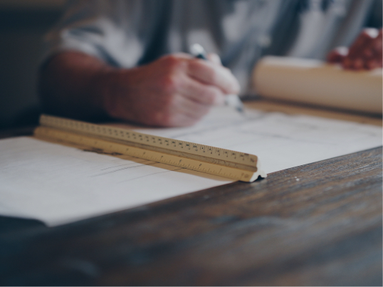
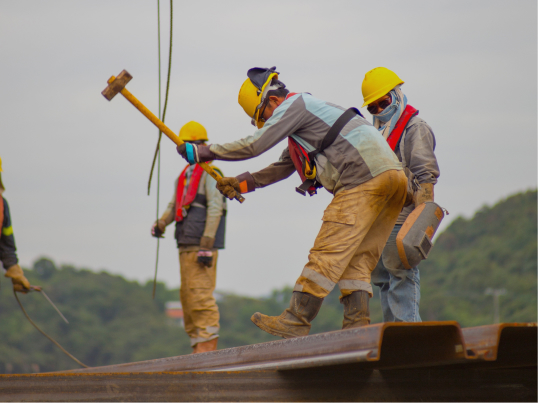
The images I selected reflect the type of work they do at Superior Foundation Repair and are either used to give the user an idea of what to expect, or as background imagery supporting informational text. They are overlayed with soft black at different opacities to provide a sense of consistency throughout the site.

Improvements
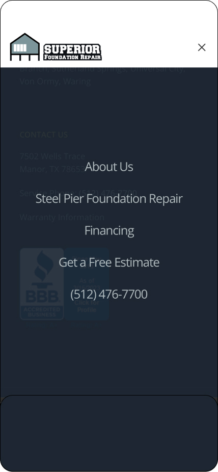
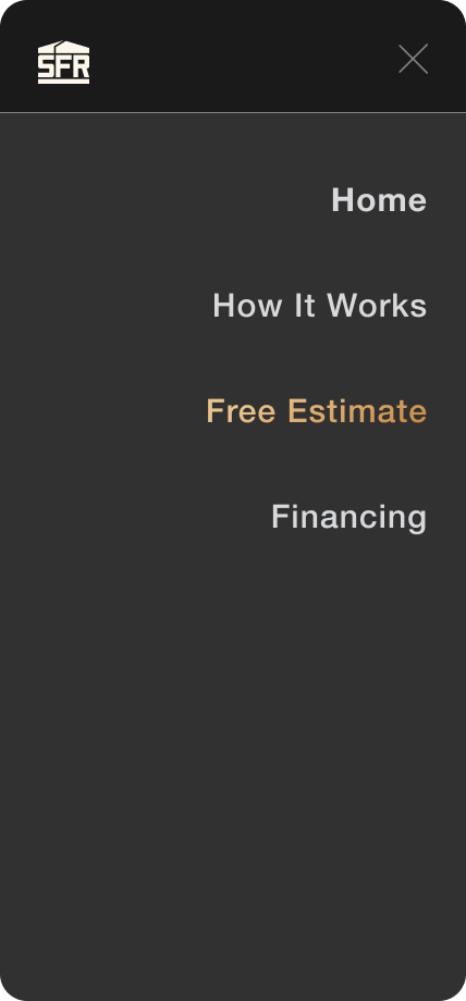
The page names on the old site were a little confusing. There was no set homepage that could be reached from the menu, the difference between ‘About Us’ and ‘Steel Pier Foundation Repair’ was unclear, and the contact phone number would open a Skype call. There was also no active state indicator to let the user know which page they were on.
Because I restructured the site, I was able to change the page names to make the navigation menu more clear for users, and add an active state indicator by changing the color of the active page name so the user would know which page they were on.
Original
![]()
Redesign
![]()
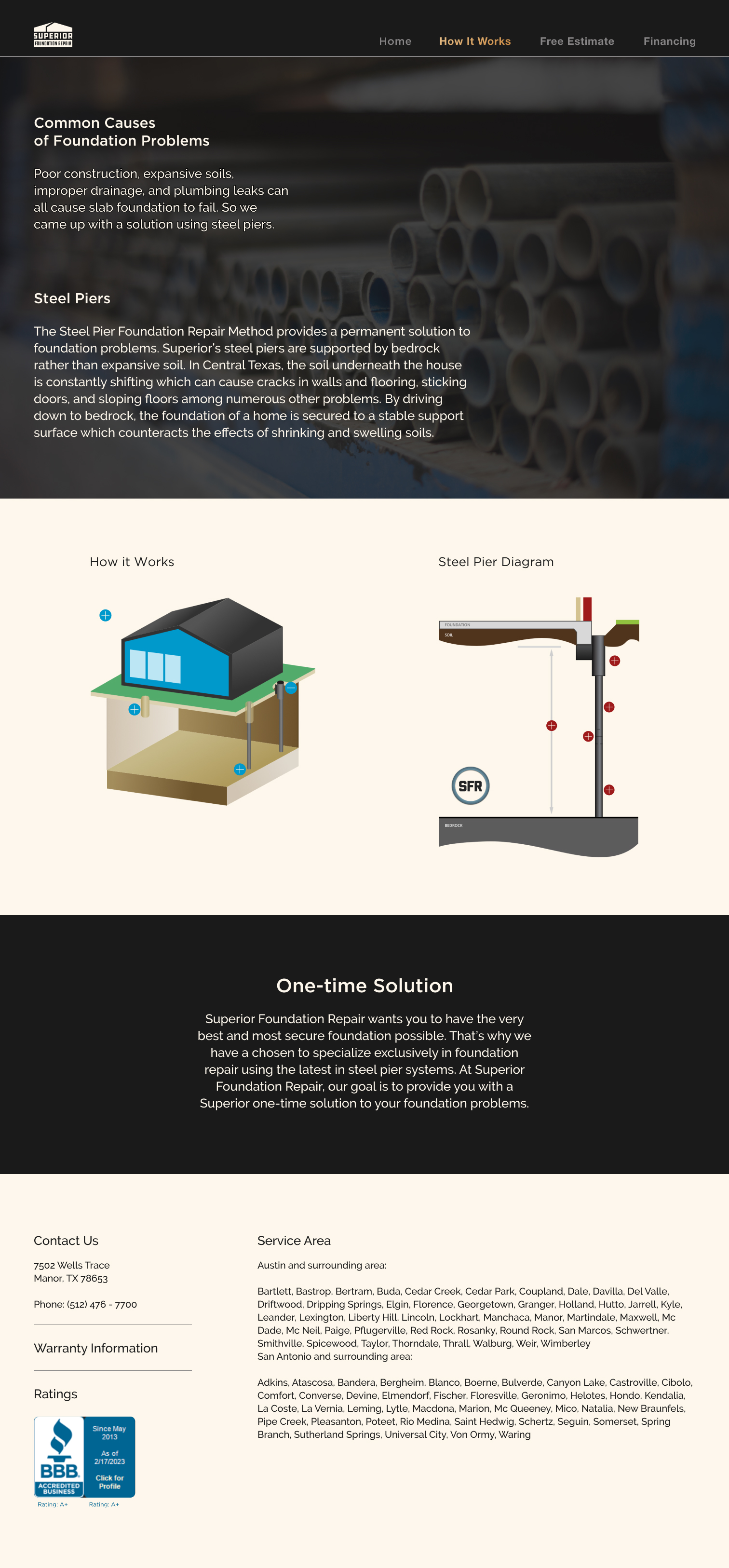
The homepage on the existing site had some issues as well. Some of the action buttons are not centered, the graphics describing the three steps have hover states, but don’t do anything if you click on them, and the headings for the paragraphs describing foundation problems are in black and therefore not visible.
In my version, I improved the look of the action button, added photos to the description of the three steps, and shortened the description of foundation problems. I was able to include the information about foundation problems on other pages because of my reorganization of the site as a whole.
Original
![]()

Redesign
![]()

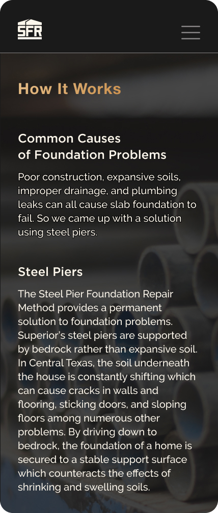
Improved look of informational pages.
Original
![]()

Redesign
![]()
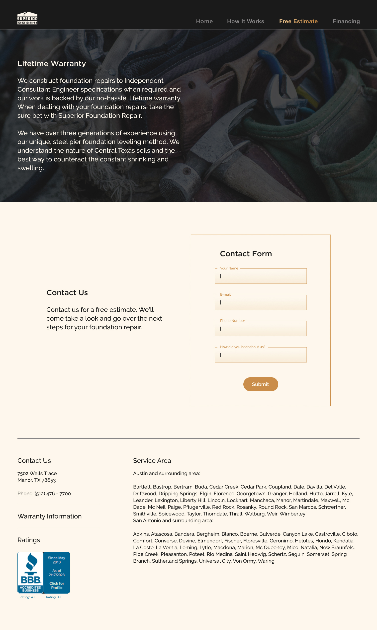
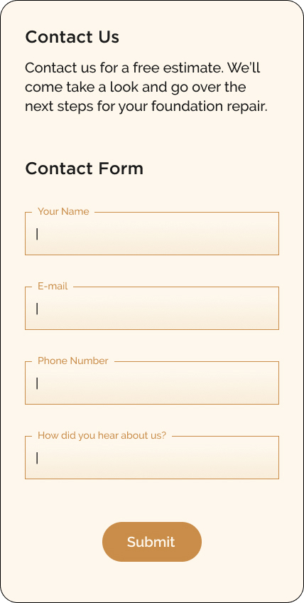
The previous site included a basic contact form with very little supplementary text explaining what the form was for.
I created a contact form that was more cohesive with the look and feel of the rest of the site and also included additional information so the user could understand the purpose of the contact form.
Original
![]()

Redesign
![]()
I also condensed the information that needed to be at the bottom of the screen for potential clients to understand the services being offered. My goal was to make it easier to understand and not overwhelming to the user.
Original
![]()

Redesign
![]()
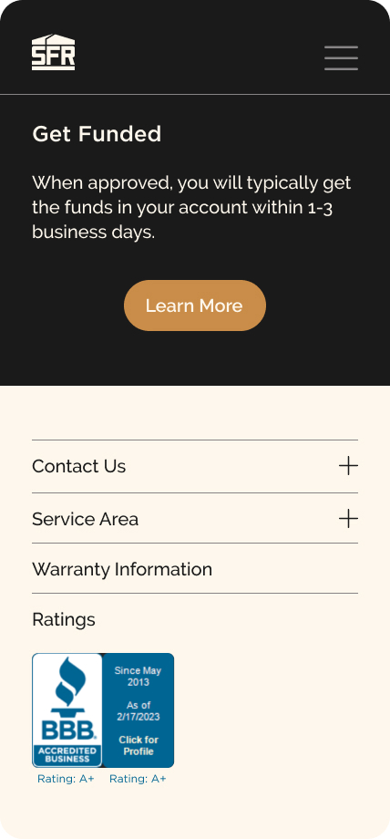
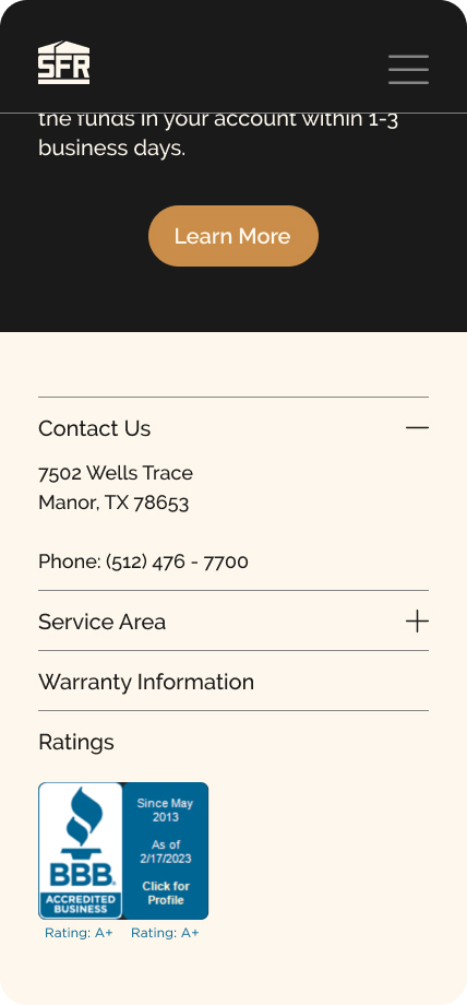
Responsive
After finishing the mobile screens, I created desktop versions of each screen to facilitate a responsive site.
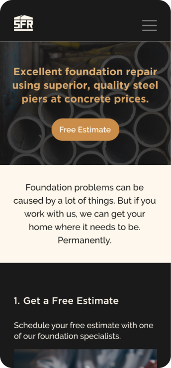
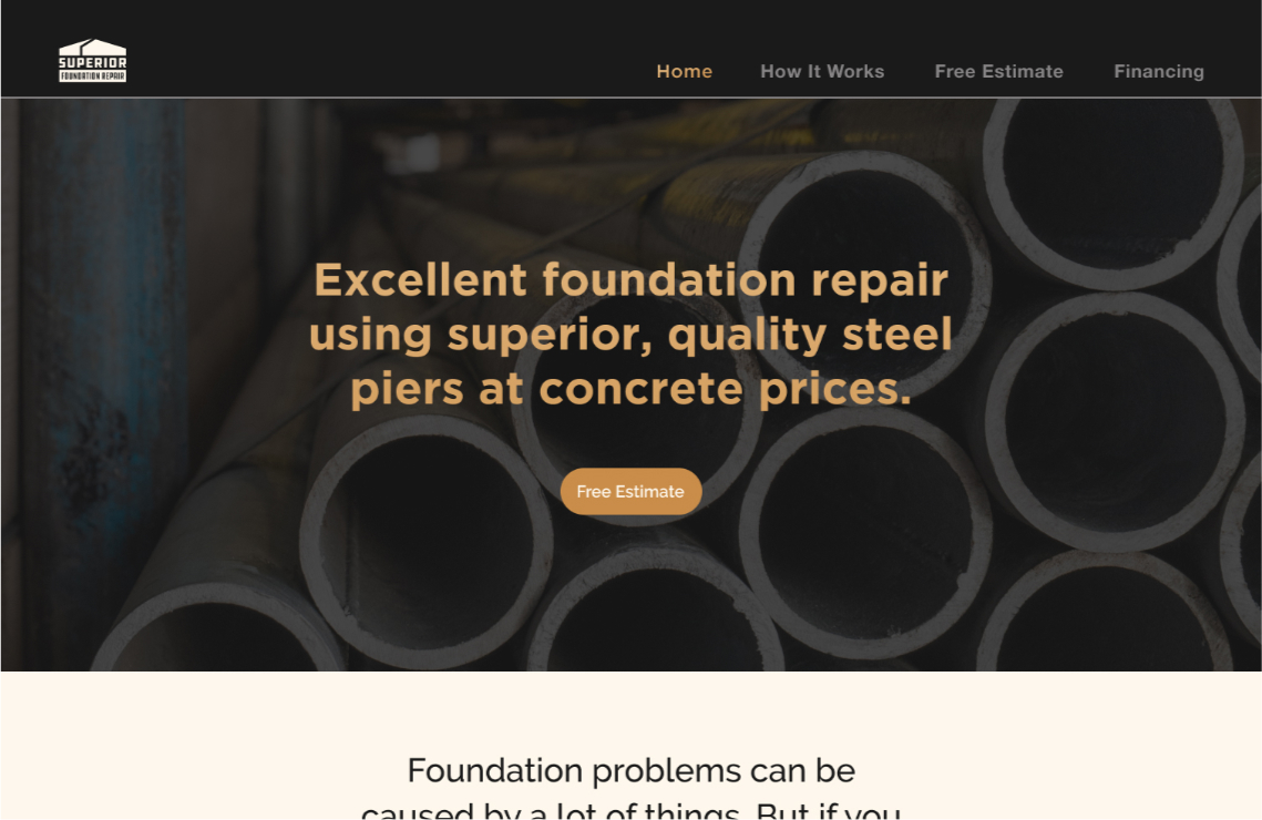
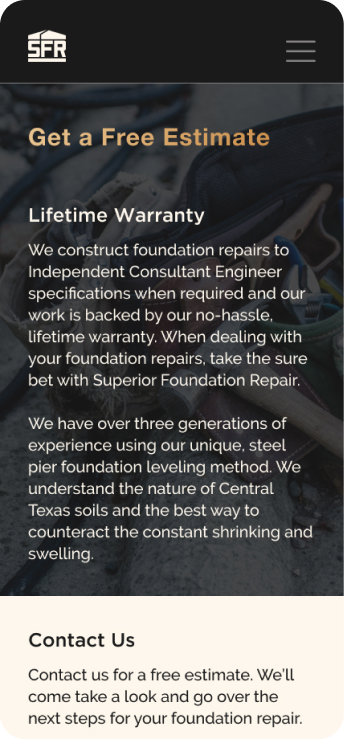

Final Screens
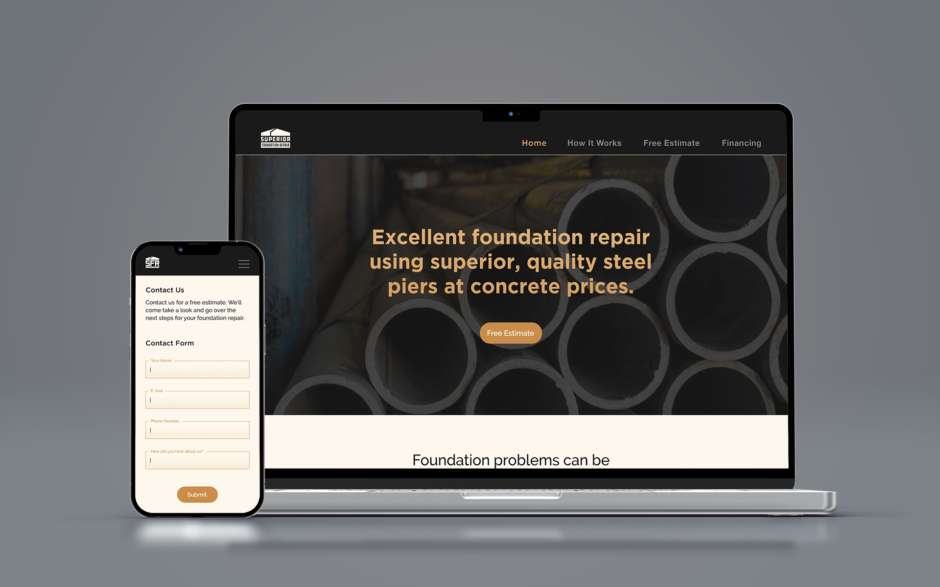
After the full redesign process was complete, I had completed high-fidelity wireframes and prototypes for both the mobile and desktop version of the site.
Prototypes
Mobile


Desktop

